Easo
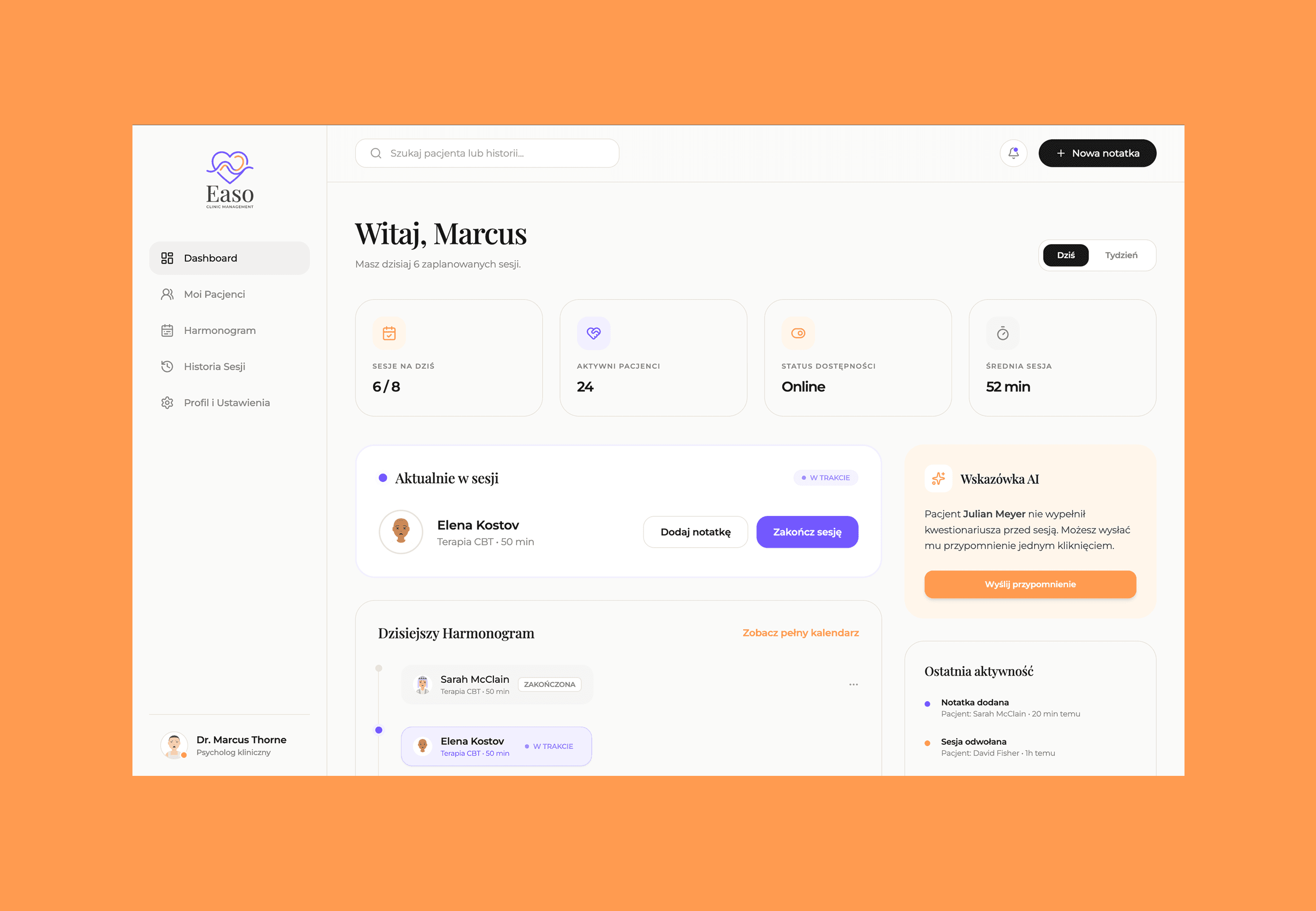
Easo is a modern clinic management platform designed to streamline scheduling, patient management, reporting, and therapist workflows within one integrated healthcare system.
Web App
Behind the Screens
Role: UX/UI Designer (solo project)
Type: B2B SaaS - Web App
Year: 2026
Tools: Figma, Superdesign, Claude
Context & Project Goal
Easo is a clinic management platform designed for therapeutic practices that want to replace scattered spreadsheets, phone bookings, and generic CRMs with a single, cohesive system. The project came to me as a design brief with a clearly defined audience: clinic decision-makers, investors, and potential partners.
The goal was to design a role-based system with dedicated interfaces for four user types: clinic administrator, therapist, individual client, and corporate client. The scope covered information architecture, core UX flows, a mini design system, and presentation materials.
The Problem
The therapeutic care sector in Poland is largely undigitized or digitized only halfway. Clinics rely on combinations of paper records, generic tools (Excel, Calendly, manual bank transfers), and systems never built with therapy workflows in mind.
The consequences are concrete:
Therapists spend a disproportionate amount of time on administration at the expense of patient work
Data is scattered across tools, making reporting and financial oversight difficult
Patient registration is multi-step, inconsistent, and often manual
Clinic administrators have no real-time visibility into KPIs or team performance
The brief called for a product that isn't "just another CRM," but a system built specifically around the rhythm and demands of therapeutic practice.
Discovery - Research & User Understanding
Given the nature of this project (a conceptual brief without direct access to end users), I grounded the research in three sources:
Competitive analysis
I audited existing solutions including Cliniko, SimplePractice, Tmsoft, and local Polish clinic management tools. I analyzed navigation structure, role architecture, data presentation patterns, and UX gaps - particularly in the context of the Polish market, where local alternatives tend to be visually outdated and procedurally rigid.
Industry desk research
I drew on publicly available data on healthcare digitization in Poland (reports from NIL, NFZ data, e-health market analyses), which consistently point to clinic management as one of the least digitized areas of healthcare in the region.
Persona-driven journey mapping
The brief included four well-defined personas with goals and pain points. I used these as the foundation for mapping user journeys and prioritizing features - asking "what does this person need to do fastest every day?" drove every structural decision.
Key insights:
Therapists need the calendar as their home screen - it's their primary daily tool
Administrators need financial oversight and access control, not another calendar view
Individual clients are conditioned by consumer booking apps (ZnanyLekarz, Booksy) - the UX bar is high
Corporate clients need a view of hour pools and costs, not individual session details
Define - Synthesis & Problem Definition
From the research, I framed the core design challenge:
How do you design one system that feels purpose-built for each role, without fragmenting the product or increasing technical complexity?
I defined four guiding design principles:
Role-first navigation - each role has a different home screen and a different set of shortcuts
Data density on demand - dashboards surface what matters most; detail is available one level deeper
Minimum administration for therapists - everything that can be automated, is
Trust through transparency - clients and administrators can clearly see what's happening with their data and money
Ideate - Generating Solutions
I worked iteratively, starting with per-role information architecture before moving into visual design.
Key decisions during ideation:
Shared shell, different content
All roles use the same structural layout (top bar + side nav + content area), but the nav contents and default view differ by role. This keeps the system technically consistent while making each role feel "at home."
Prioritizing the right hero views
From the four roles, I identified the most compelling screens for the presentation layer: the therapist's calendar (high-frequency daily use, rich in interactions) and the admin dashboard (KPIs, financials, team management - demonstrates system depth). The individual client flow provides contrast - lightweight, consumer-grade.
Components as the language of the system
Rather than designing screens in isolation, I built a component set (cards, status tags, forms, tables, empty states) and used it as a module library throughout. This accelerated high-fidelity work and ensured visual consistency across roles.
Prototype - From Sketches to High-Fidelity
I worked in Figma, supported by Superdesign for component variant generation and Claude for concepting microinteractions and animations.
Process:
Low-fidelity wireframes for each role's core flows (structure-focused, no visual polish)
Design system definition - color palette, typography, grid, iconography
High-fidelity key screens: therapist dashboard, client booking flow, admin panel
Animations and microinteractions (view transitions, hover states, loading patterns)
Visual direction
The system targets a "professional healthcare" aesthetic - clean, light, with controlled information density. I deliberately avoided an overtly clinical look (cold blues, sterile layouts) in favor of a warmer palette that still communicates trust and competence. Rounded components, soft shadows, and clear typographic hierarchy keep the interface approachable without sacrificing credibility.
Test - Validation & Feedback
Given the conceptual scope of the project, formal user testing was not part of the brief. Validation happened through:
Heuristic self-review - a structured walkthrough of key screens against Nielsen's 10 heuristics, with particular focus on system status visibility, match with real-world expectations, and user control
Brief-anchored review - checking each screen against the defined persona goals: does this view answer what this person needs to do right now?
Benchmark comparison - reviewing final screens against the competitive audit, evaluating readability and cognitive load
The main revision following validation was simplifying the therapist dashboard. The initial version had too much information above the fold, which diluted the calendar's role as the central, primary element.
Outcome & Reflections
The project resulted in a complete set of deliverables: hero screens for three roles, a mini design system with role-specific components, and a presentation deck for decision-makers and investors.
What worked well
The role-first approach to architecture meant that despite the system's complexity, each view stays focused and uncluttered. Building on a component library from the start significantly accelerated the high-fidelity phase and kept visual consistency without constant decision fatigue.
What I'd do differently
In a real product context, the next step would be user testing with therapists and clinic administrators - particularly to validate the information hierarchy on the admin dashboard, which carries the highest data density. I'd also want to explore the onboarding flow for a new clinic, which sits outside the current scope but would be critical for real-world adoption.
What this project taught me
Designing for multiple roles within a single system requires discipline at the architecture level. The temptation to "add one more shortcut" to the therapist's nav is constant, but every unnecessary element increases cognitive load for someone using the system every single day.
Restraint is a design decision.